Blue Hour
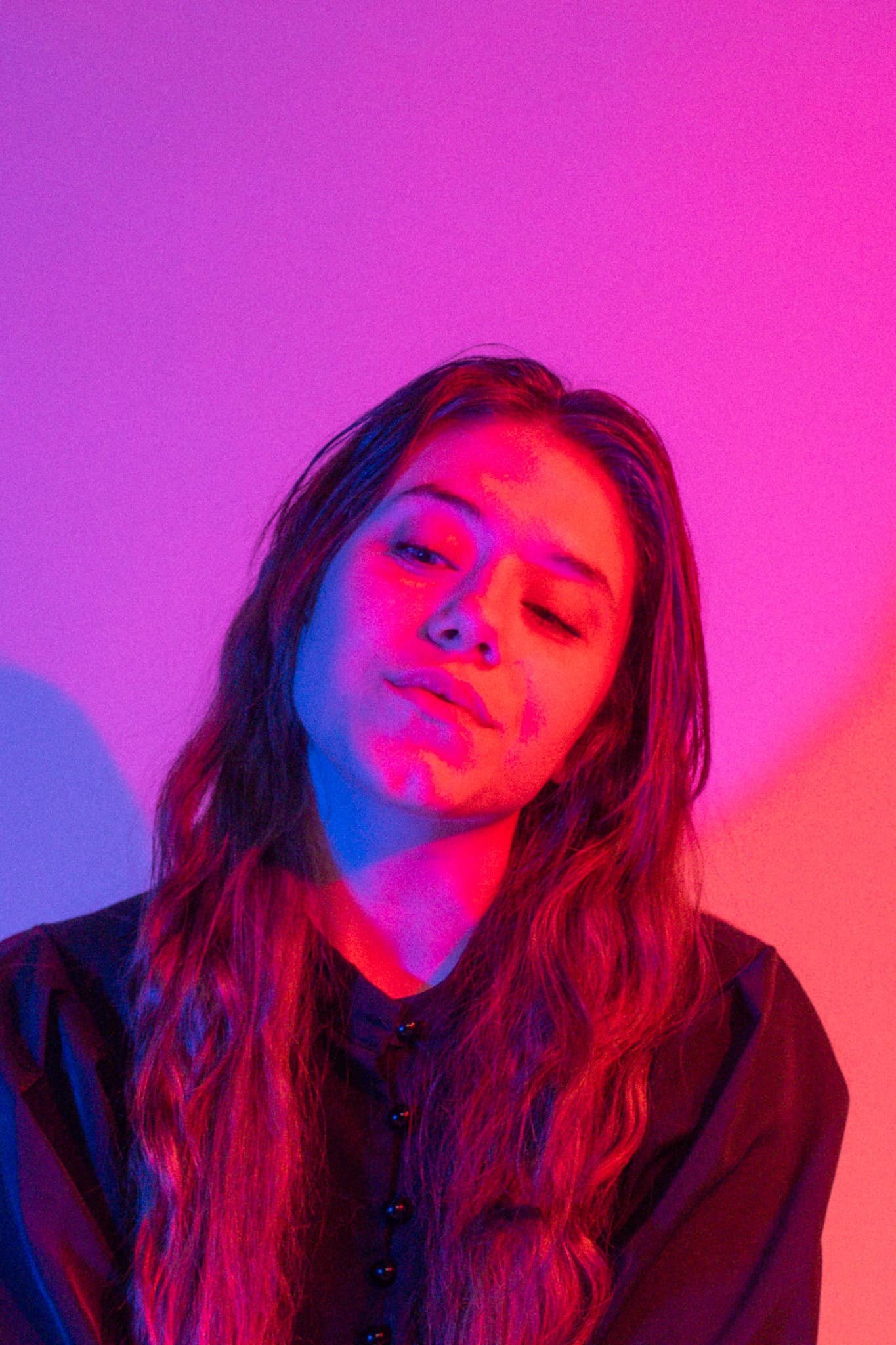
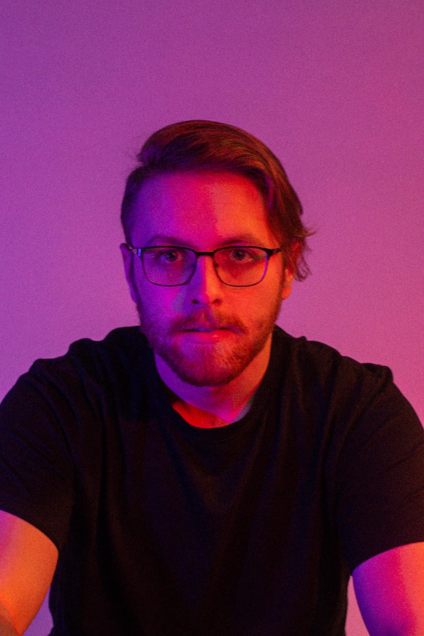
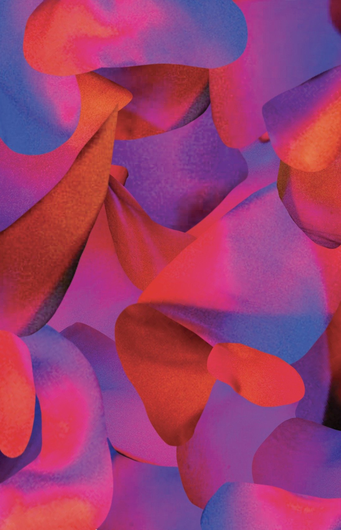
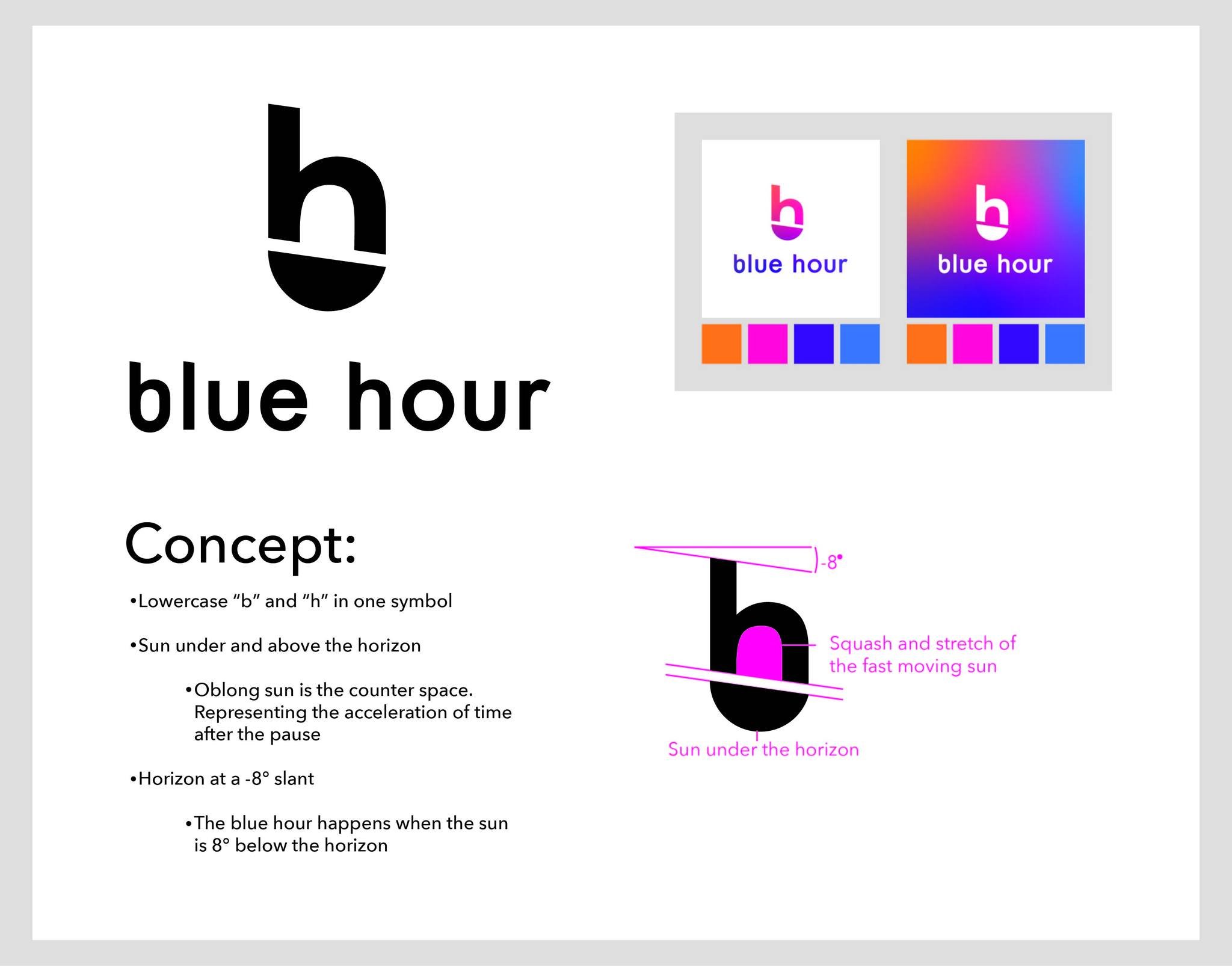
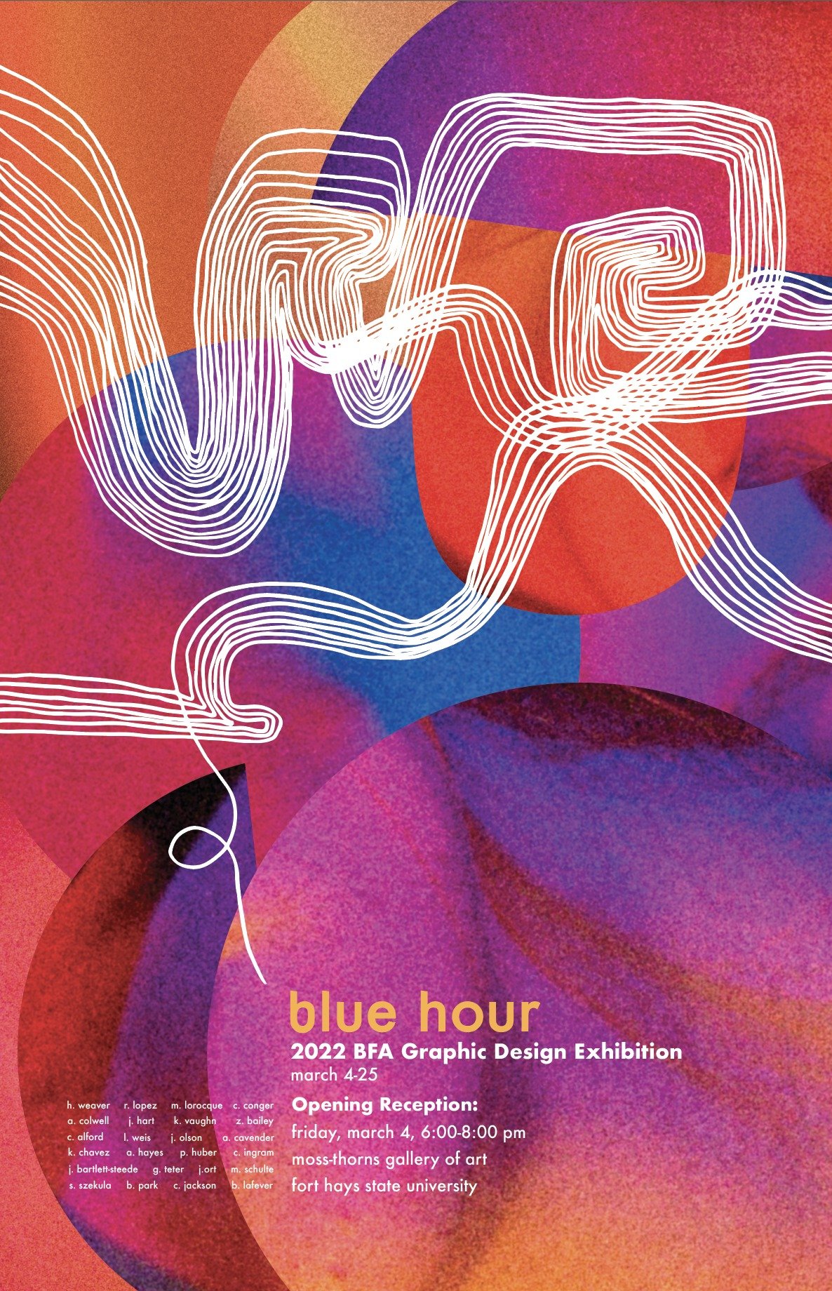
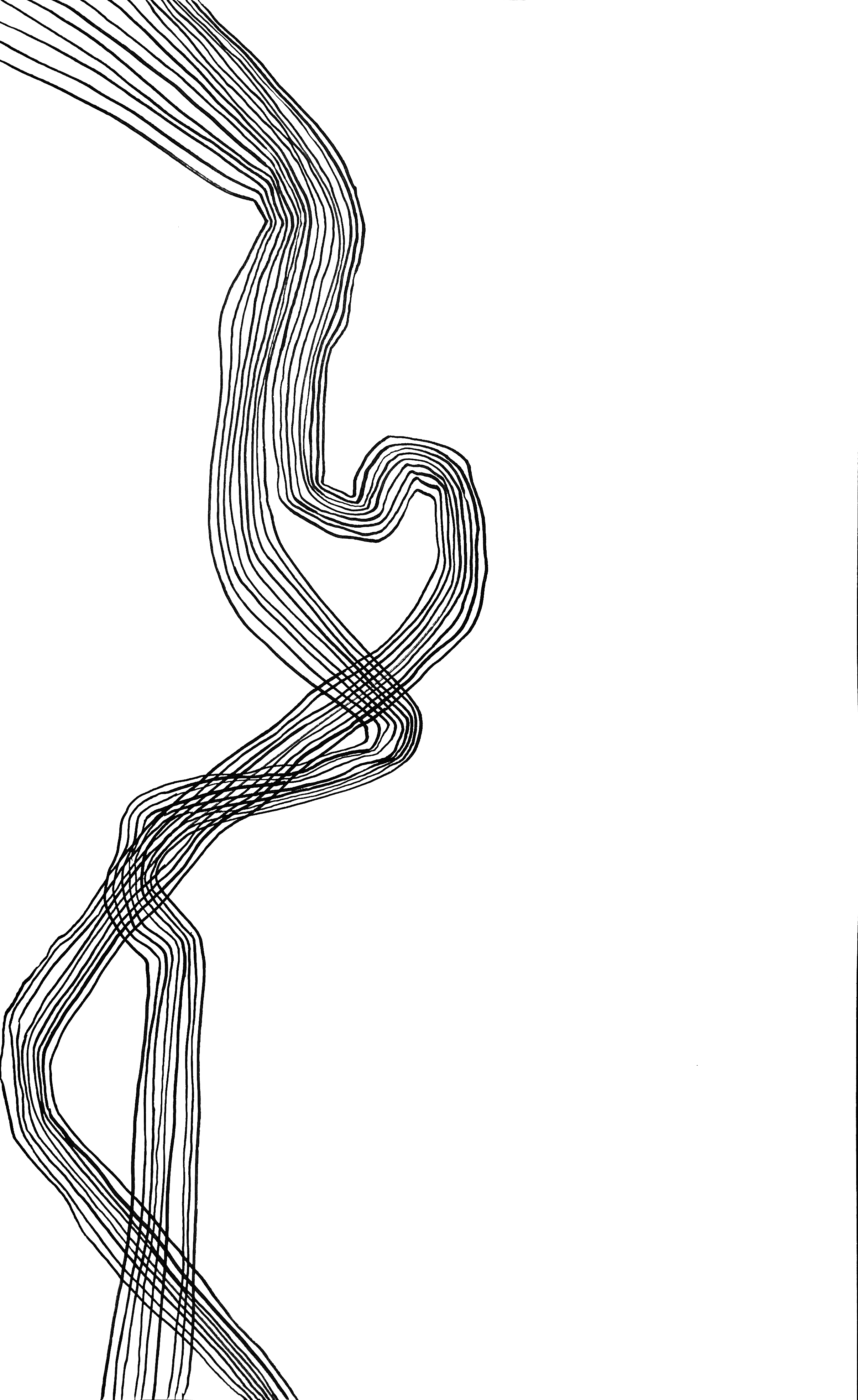
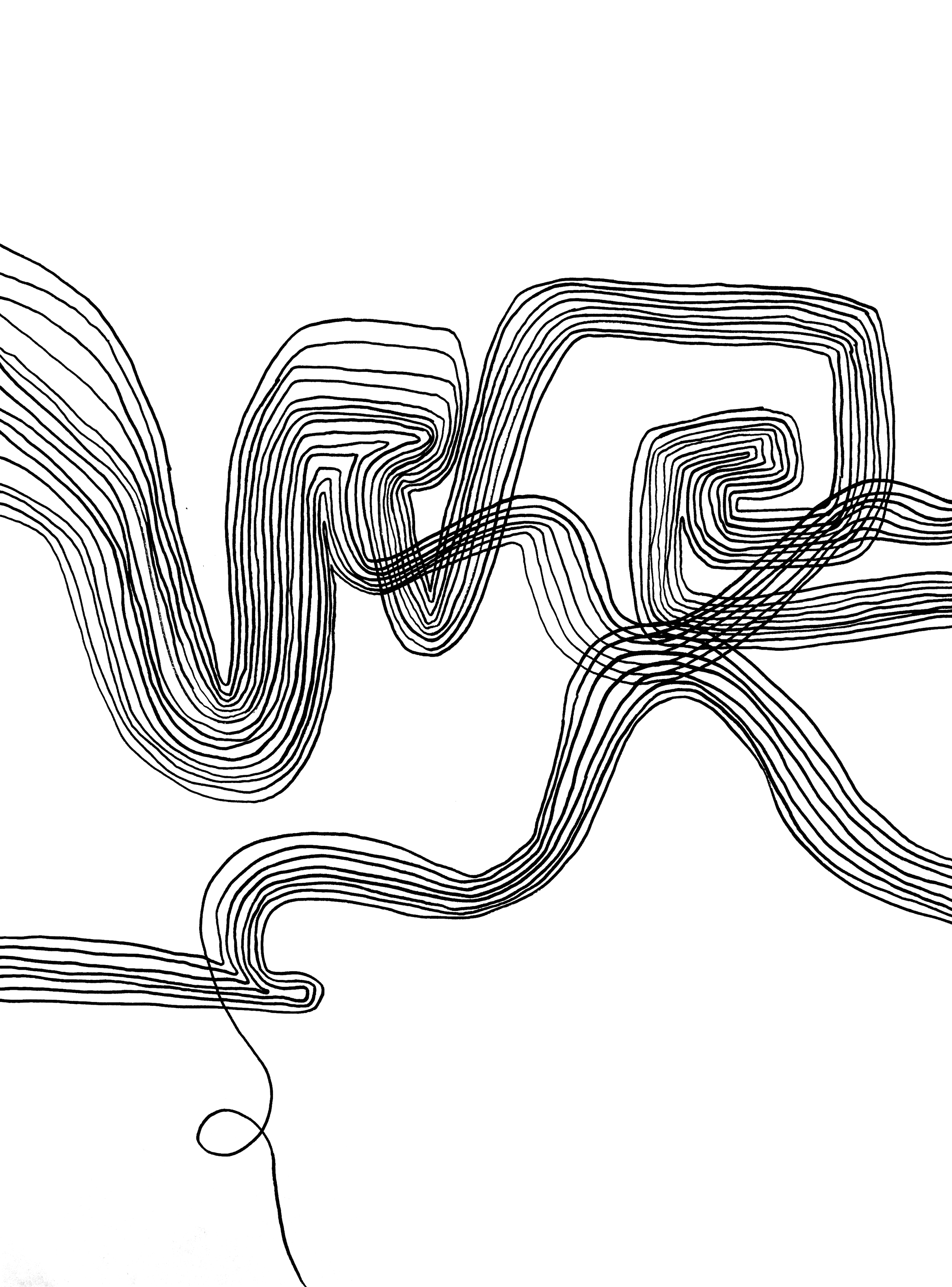
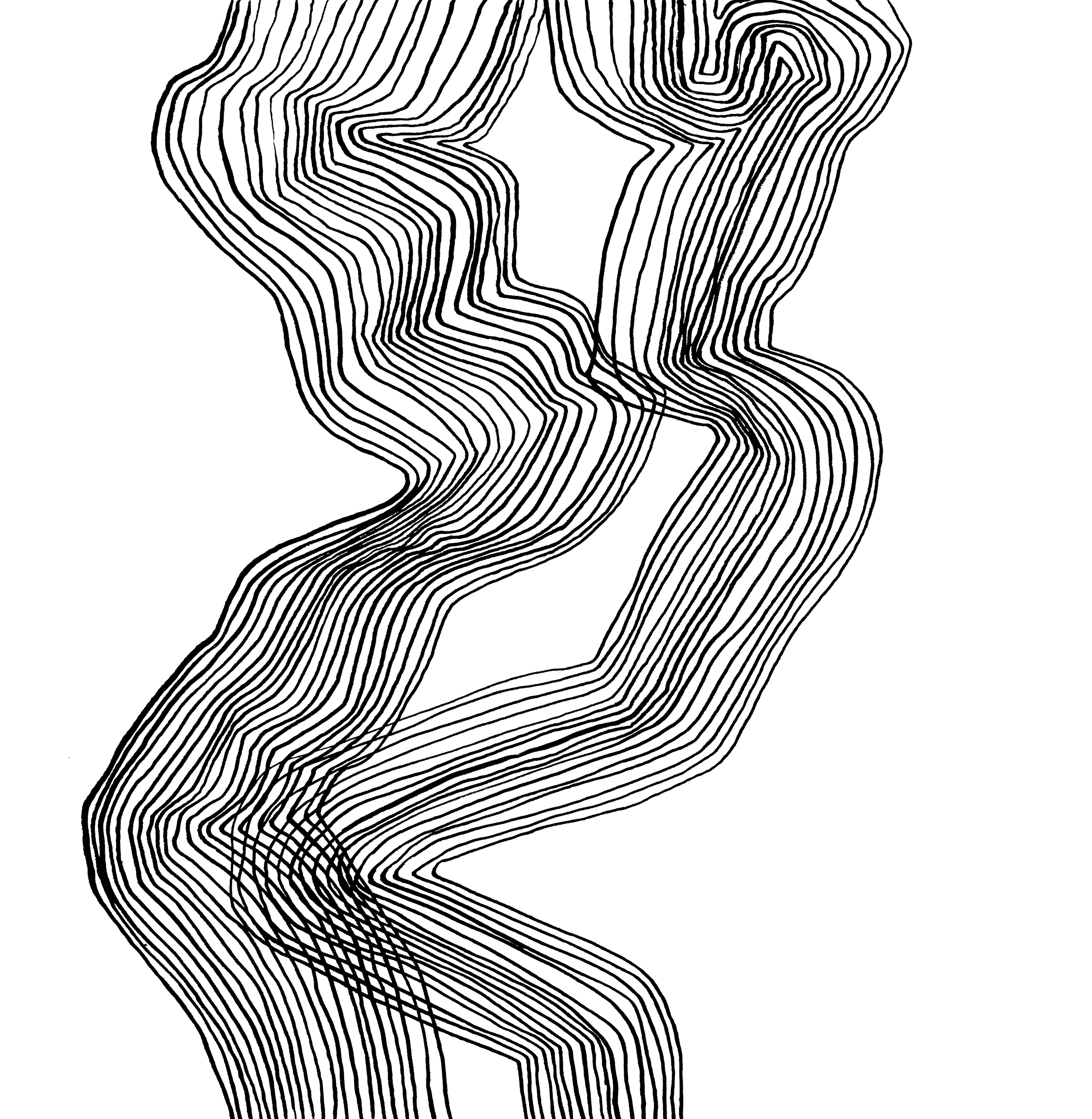
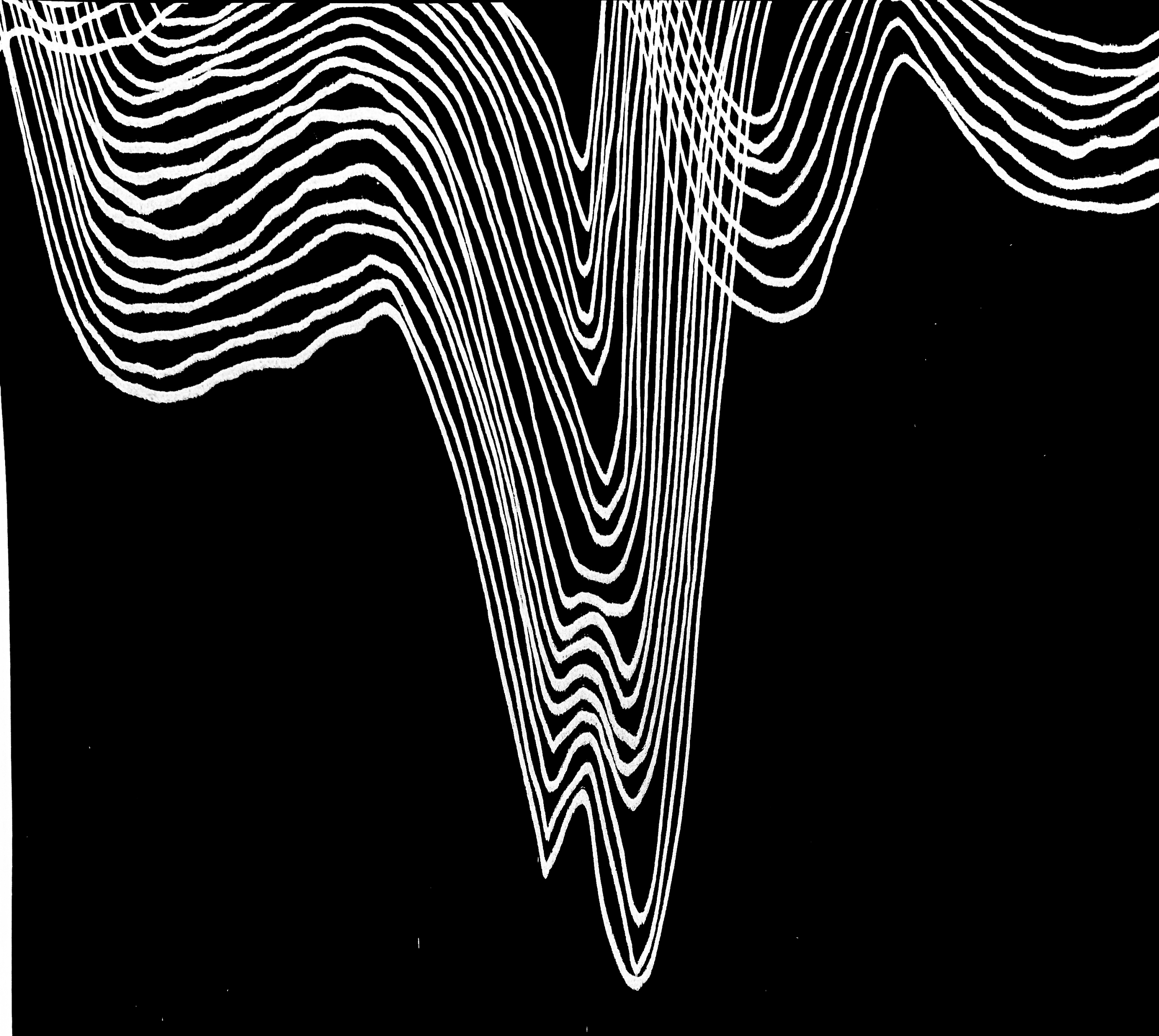
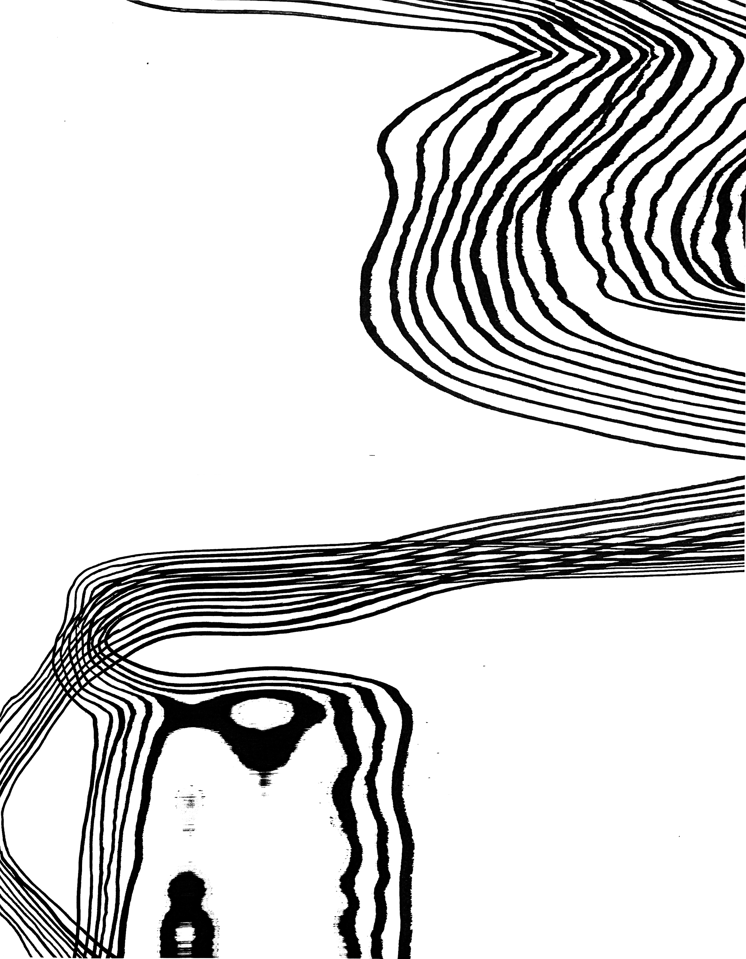
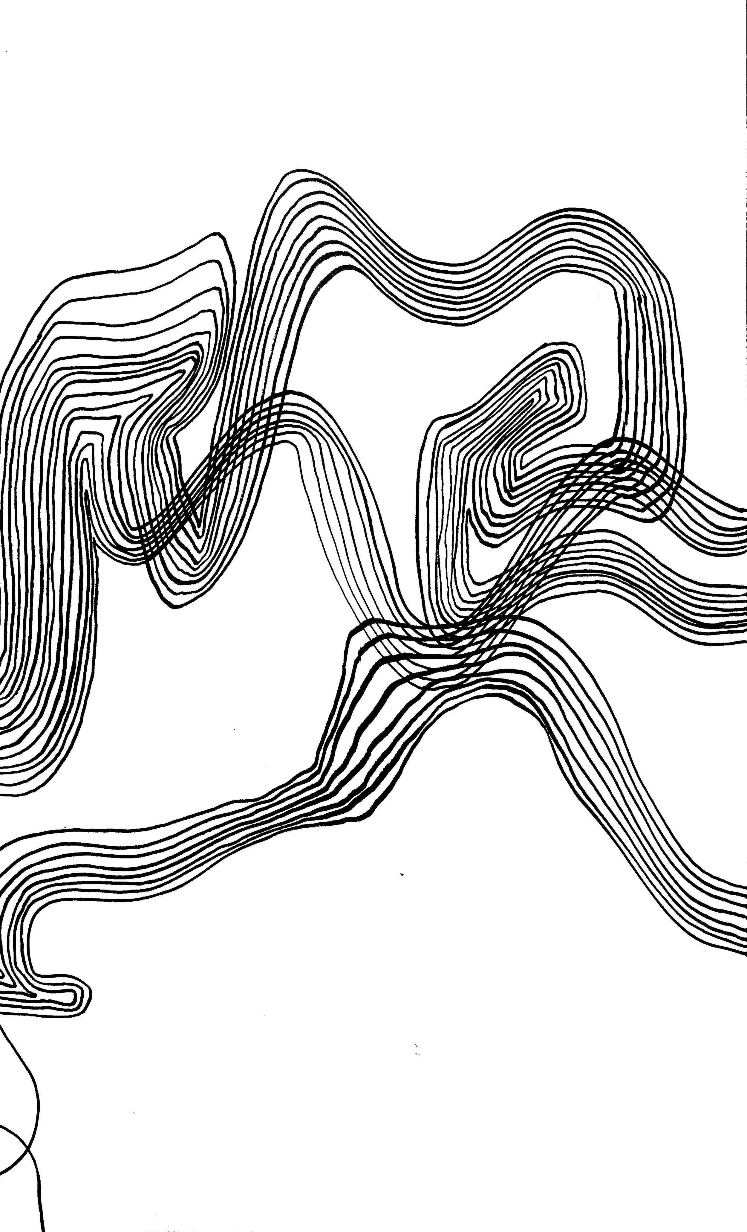
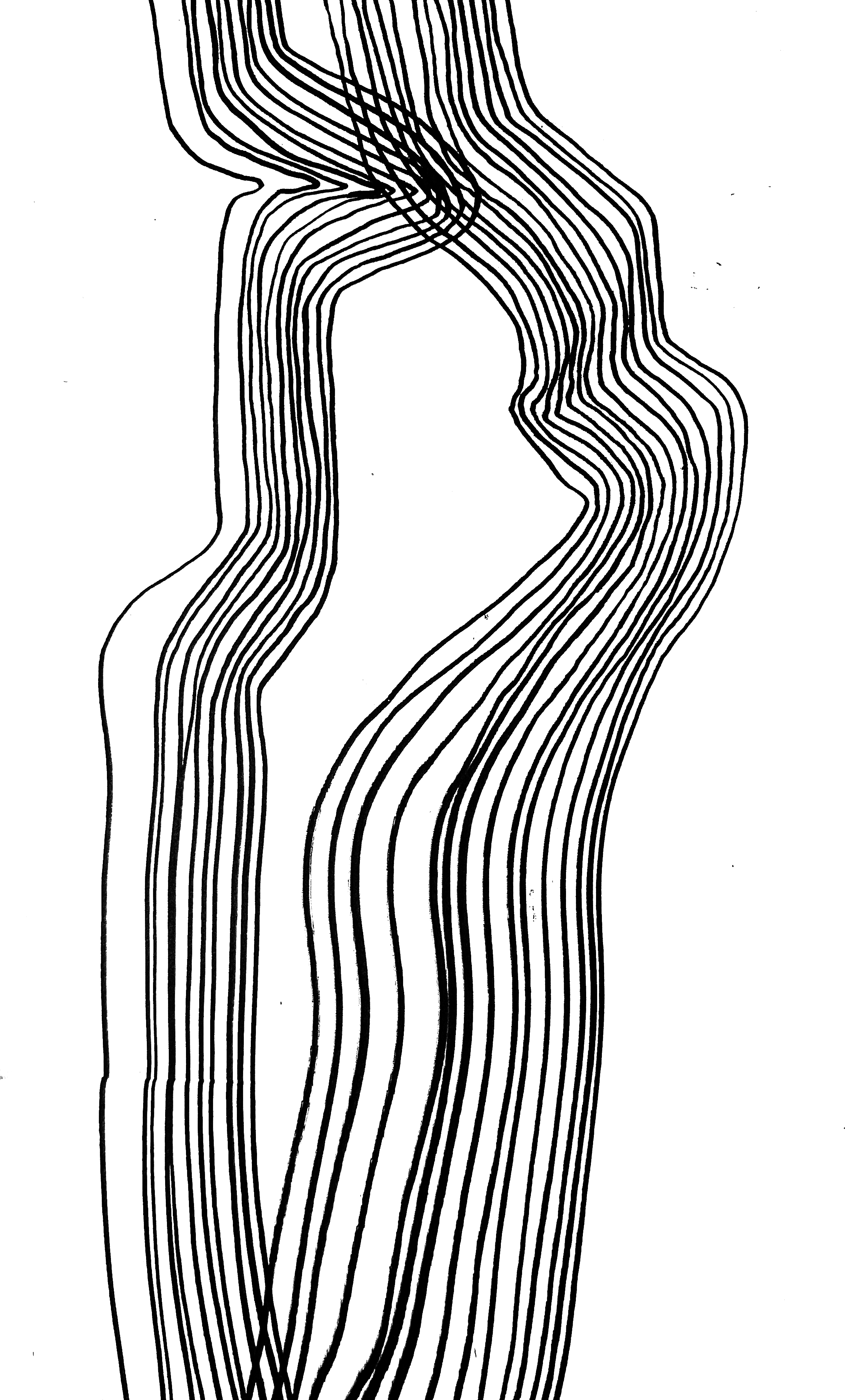
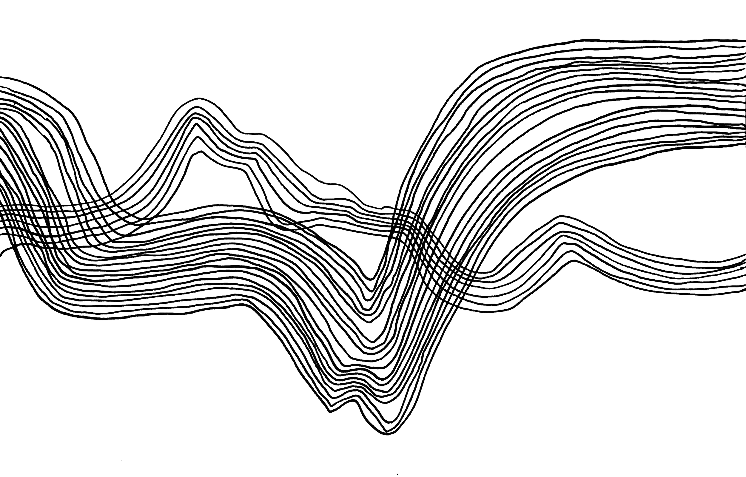
For our senior class design exhibition, I worked with a partner to create the posters for our show. The logo and a rough color palette were some of the only design elements we had to go off of- so our designs ended up greatly influencing the overall branding of the exhibition. I sketched a bunch of lines and then moved them around in a copy machine to create the flowing abstract lines that ended up being used as a continuous design element throughout the exhibition. We also zoomed WAY in on photos of our wonderful classmates to get the grainy color gradients that ended up in our final product!
Design Process & Inspiration
